Bindlestiff Picnic Co.
Instructor
Brian Satalino
Elements
Branding
Packaging
UX/UI
During covid, I was tasked with the creation of a business that was meant to exist solely in the realm of at-home and outdoor dining rather than it be the last option for former dine-in establishments. Designers were sorted into groups where we created a restaurant concept and then broke off to each create our own spin on the branding. I––along with Breanna Kerr, Vy Le, and Likyoung Kim––produced a social-distancing safe alternative restaurant: a picnic company that specialized in delivering meals meant to be enjoyed outdoors.
My team conducted research into both our audience and our business logistics. After the pandemic's start, research showed that over 70% of mothers and 90% of fathers being in the workforce, and families were being stretched thin. Parents were now watching their children during regular school and daycare hours on top of their work-from-home jobs and providing all meals and snacks. People were now also spending more time than ever on phones, computers, and tablets–with the average person receiving over 6 hours a day of screen time. We wanted a concept that allowed people to safely enjoy an experience away from their screens while relaxing with their family and friends.
Looking into other companies, we were able to find similar business practices. Some of these were picnic services and restaurant-prepared meal baskets. Both of these options, however, required the customer to pick up the sets on location rather than delivery. Other options included experimental delivery practices like drone-dropped burritos and Domino’s “Hot Spot” outdoor delivery locations.
Our business was designed to encourage people to seek out what options they still have outside the home and be a group-friendly option for all different households and families. As an homage to the idea of travel and nature, along with a convenient carry-on motif, I was inspired to design my company branding around the bindlestiff––or the men known to carry knapsacks/bindles holding their belongings when traveling to find work. The logo and name went through many rough drafts before settling on the final version.
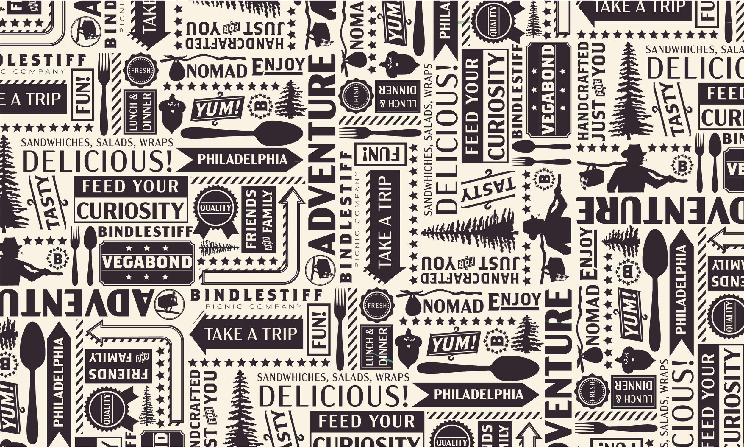
The Branding for Bindlestiff focused on drawing elements from its character, taking on a green-heavy naturalistic palette with an additional red as both a color contrast and a nod towards the stereotypical red check picnic blanket. I also pulled heavily on masculine aesthetics, which influenced my choices of bold, structural type and butcher paper-inspired patterning.
One of the most critical aspects of this project was the app. As a business dedicated to providing delivery meals on the go, having an app that allowed customers to have a menu easily accessed at their fingertips, and service to contact delivery drivers was necessary. We also decided that our delivery system would have to be based on GPS tracking rather than a given address, and for areas that weren’t automobile-friendly, we devised a series of cargo bikes.
The delivery packaging for Bindlestiff deviates from the typical picnic basket to instead supply customers with a furoshiki wrapped box, giving the customer a bindle of their very own. Each container was also designed to be environmentally friendly and was based on recyclable and/or biodegradable paper and plastic. The patterned wax paper was the first element designed, and it was an aesthetic choice I adapted onto the other packaging.


